As technology marches on, needs and wants of users change. As a support engineer, it is my job to make sure my users are getting what they need, in a quick and orderly fashion, in a method that is pleasing to them. Analytics is key in finding what pleases them.
In an effort to provide for those needs on this site, I’ve attempted to “compress” the site, without really compressing it. Does that make sense? This post is targeted to other webmasters out there who might be thinking about changes in their site design.
Essentially, I’ve attempted to display more information on-screen, and reduce the footprint of site elements. Users still need those elements, such as the top line menu, the search box, profile editing, tools, and other things. But the idea is to make those “support functions” less intrusive into the meat of the site.
The usage of analytics is key to discovering how your users are using your site. You can utilize these tools to see what your users are viewing, how long they are staying on your site, what technologies they are using, and much more.
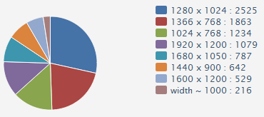
One of the things I discovered is the increased size of the average users screen resolution. When this site was first built, in the days of yore and long ago, the reigning screen size, was 1024×768 pixels, with 800×600 a close second. My, how times have changed!
Using my handy analytics package, I took a sampling of user screen resolutions over the last 24 hours. As you can see in the chart, the average user screen resolution is now 1280×1024, with the former “standard” way down at #3, and 800×600 nowhere to be found.

This change (and you should always be watching for change!) allows a web designer to modify their site(s) to more closely match what the users expect. This particular site is a technology related site, in which users are coming to mainly for information. They don’t want to see cartoons, games, and fluff. They need info!
So in order to give the user what they want, we take advantage of the extra screen real estate to pack more information into the browser window. Using CSS styling, we can effect these changes site-wide by making changes to one file. If you’re a designer not using CSS, get your butt in gear. You’re missing out.
Analytics can also tell you what browsers your users are using. This handy bit of information is key in what things you build into your site. Alright, admittedly it is not as important as it used to be, with more browsers adhering to W3C standards. But it is still important to test your site in at least the top three most used browsers on your site.
| Browser | Visitors |
|---|---|
| Google Chrome | 2044 |
| IE 8 | 1670 |
| FireFox 6 | 1259 |
| IE 9 | 1034 |
| FireFox | 470 |
If you are not testing in these browsers, you need to. Why? Because simply, things render differently in different browsers. If you are not sure your site is rendering properly in the browser your users are utilizing to view your site, you are doing them a disservice. They won’t be back if they can’t read your site!
One last thing about analytics, design, and you: sources. Kind of unrelated to design, but still in the ballpark.
Ever wonder where your users heard about your site? Did they come from a search engine? Did they click a link in some forum on the other side of the world? Which search engine sent the traffic? Why do you care about sources?
With a good site design, you are not just making things easier for your users. You are also making things easier for search engines. If a search engine spider needs to crawl through tons of non-rendering items, it could potentially hurt your search engine rankings. Some things you might want to keep in mind:
- Make use of your tags, like H1, H2 etc. They are there for a reason.
- Properly form your (x)html; be sure to close your tags!
- Optimize your graphics. Nobody likes to download 10mb pictures of your dog.
- META tags are still used by search engines, contrary to what you might hear.
- Declare your doctype!
So, I’ve rambled enough for one post. Before I get out of your face, though, I’ll share a couple of packages that I can recommend without reservation.
- Google Analytics: Free and easy, you can track just about anything on your site with GA. Realtime is coming soon, but not in place for everyone yet.
- HiStats: Also free for most sites, this provides the same information as Google, but with the added bonus of realtime stats. You can see who is viewing what page on your site, in real time.
There are tons more packages out there, some free, some not. The idea is to get insight into your users habits, needs, and wants. Using an analytics package is key in discovering that knowledge, and with it, your site design can evolve to meet the needs of your users.
Got a package or corollary? Drop it in the comments!
